betterfromfaraway

OCA Learning Log


2 Comments

Postcard Project

Here is my first postcard in our swap. Posted on as requested.

DSC07118

Things went quiet for a while but then I got these.

DSC07476 DSC07477 DSC07478 DSC07481


And added this to them. The pink was quite difficult for me to work with so I had to resort to one of the colour palette finding sites to get a colour to match.

DSC07483 DSC07484 DSC07485 DSC07486

Then this arrived.

DSC07488

And I added this.

DSC07520


Leave a comment

Part Three – Research Points

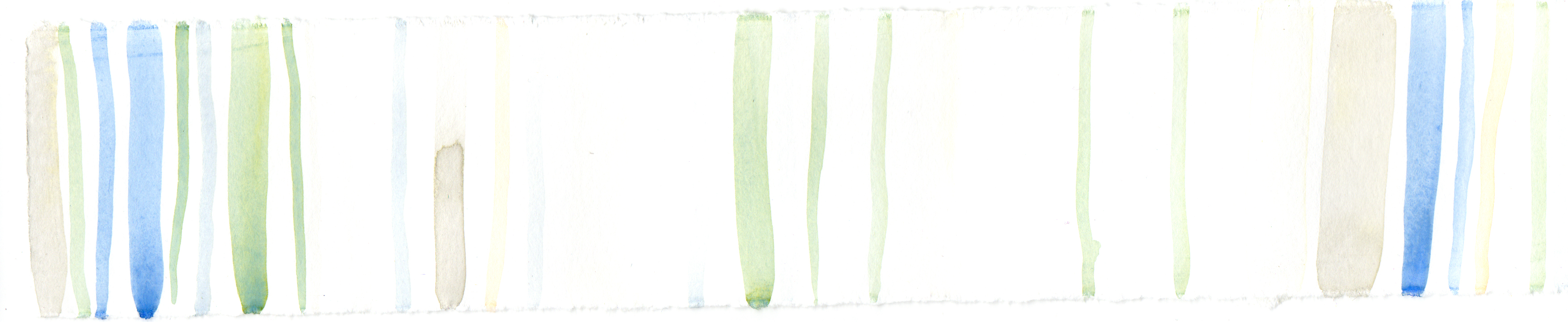
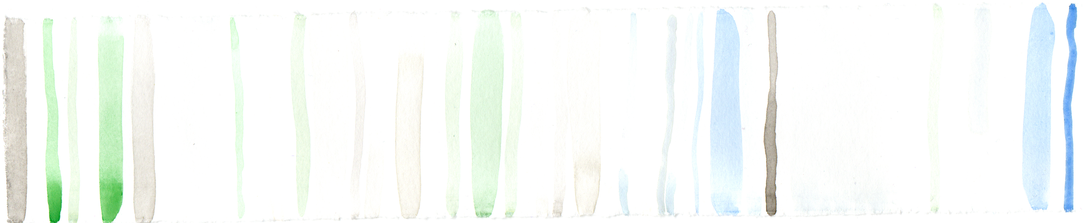
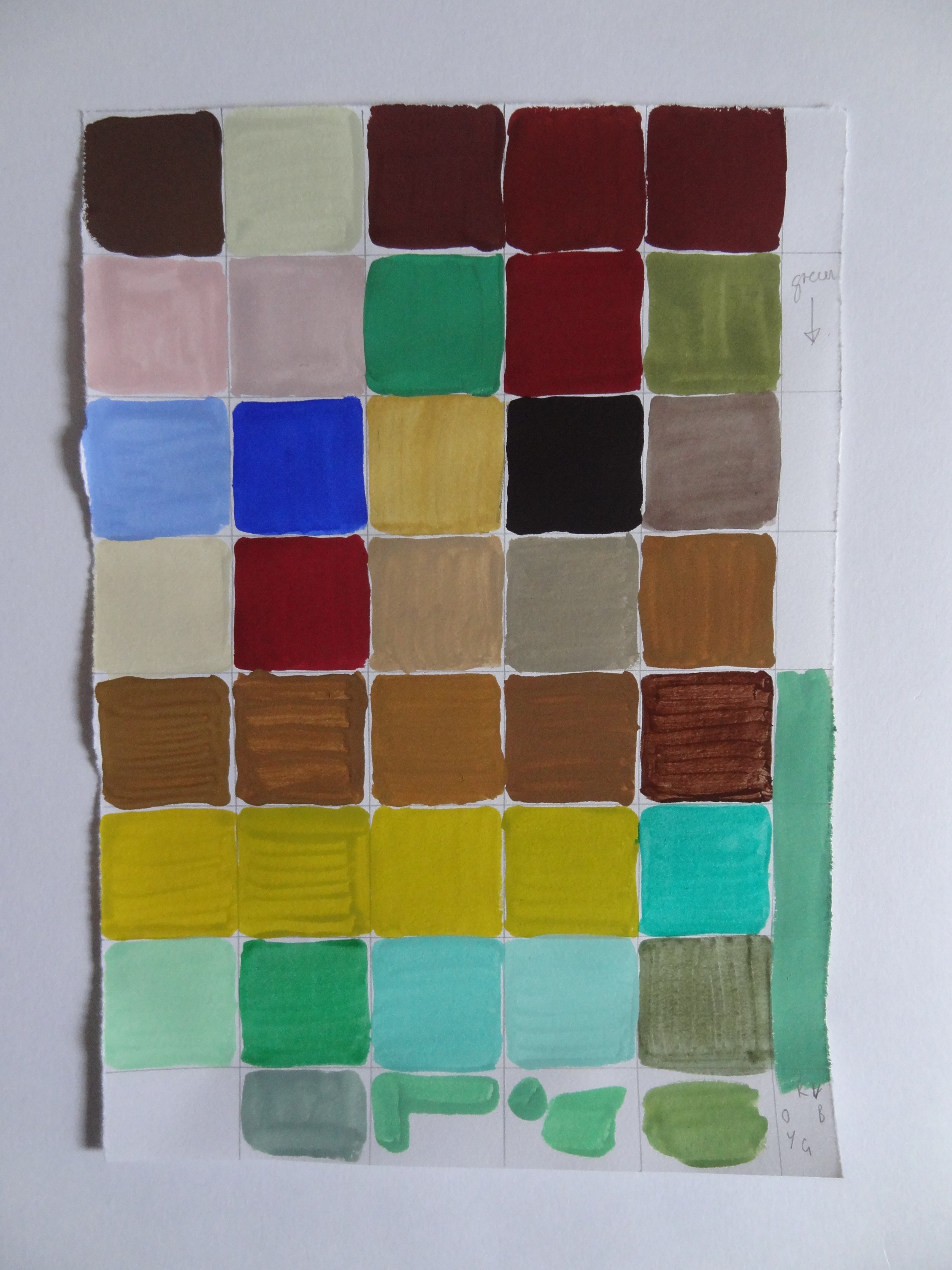
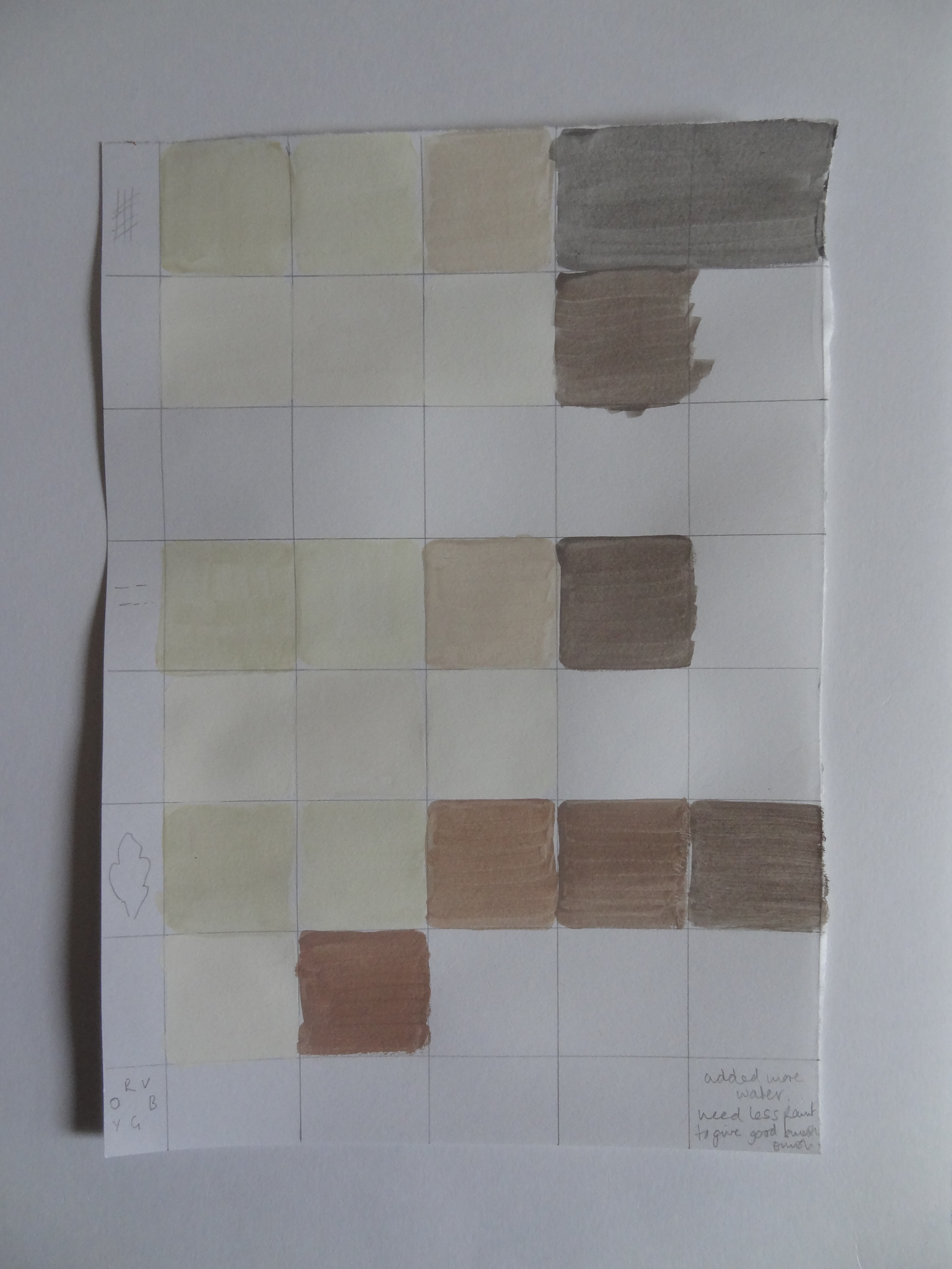
Research Point One – Use of colour


Voyage Decoration

Produces Wallpapers, wall art and furnishing fabrics using digital printing methods. These methods allow the items they produce to have painterly qualities as the print is taken directly from a digital scan of the original artwork.
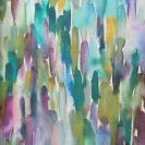
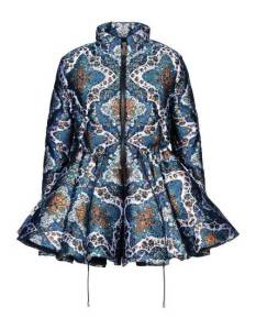
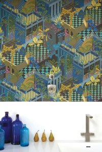
merapi_slate

Merapi

http://www.voyagedecoration.com/rashiekas-garden-wall-art-collection/merapi.php

azim_indigo-s

Azim

http://www.voyagedecoration.com/iridescence-wall-art-collection/azim.php

Many of the items produced used muted or chromatic grey colour palettes, there are very few bold, primary colours used in these products. This allows for a good tone between products from different series of products, thus making it easy for consumers to purchase a range of items from this one supplier, get them home and not have them clash with each other. Many of the staged rooms photographed on this site had neutral or white items placed to contrast with the coloured items  produced by Voyage Decoration. This allowed the coloured items to appear very brightly coloured in comparison to the neutral items they were sat next to.
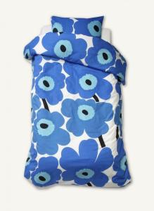
 

Marimekko

https://marimekko.com/gb_en/


Finnish design company, founded in 1951, producing clothing, bags, accessories and home decor.

UNIKKO – This design has been produced since 1964 and is still in print today. It uses four colours and a large, simplified flower motif.

065228-017_900

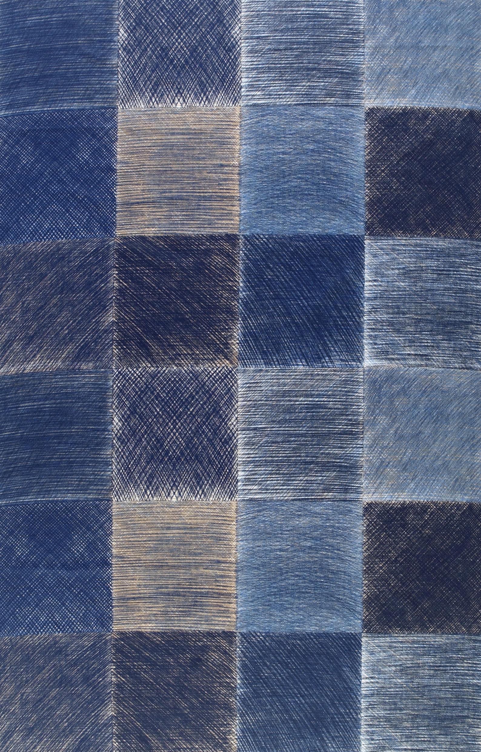
MAISEMA – Designed by Fujiwo Ishimoto, uses shades of blue in repeated squares.

MAISEMA_13349_13

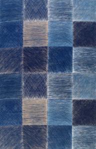
Marimekko uses large motifs and a limited number of colours in each of their prints. This gives a clean feel to the prints produced.

The company has also put its design on a FinnAir A340.  They have designed textiles and crockery for FinnAir for several years. All items use blue and green to represent “Finland’s thousands of lakes and beautiful clean nature.”

980x397_MM_landing-page

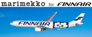
http://www.finnair.com/gb/gb/marimekko
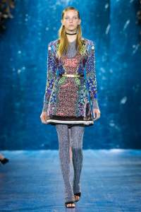
 

Mary Katrantzou

Fashion designer with a background in architecture, textile design and print.

Karantzou uses digital printing to produce bold, colourful prints often using many clashing colours.

M by Moncler used some of these prints in a capsule collection, Winter 2013

m-moncler-by-mary-katrantzou-peplum-down-jacket-in-deep-jade

These padded winter jackets are not often seen with such cheerful patterns on. Moncler produces winter jackets and has a history with equipping mountaineers for expedition. This print is a good contrast to the practical nature of the jacket underneath it.

http://www.sickathanaverage.com/wp-content/uploads/2013/11/m-moncler-by-mary-katrantzou-peplum-down-jacket-in-deep-jade.jpg

Mary-Katrantzou-RTW-SS16-London-0612

http://www.marykatrantzou.com/collections/ready-to-wear/spring-summer-2016/runwa

The dress pictured above uses very few colours but by placing small amounts of each colour across the piece optical mixing is employed to make the dress look like it is printed with many more colours than were in fact used.
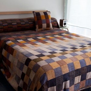
 

Wallace Sewell

Founded by Harriet Wallace-Jones and Emma Sewell.

“Designed in the South, Woven in the North” the scarves, throws and cushions designed by Wallace Sewell contain bold stripes and large blocks of colour. The colour palettes they employ range from the muted colours below to the bright red and blue used in the London Underground moquette.

1517-thumb

http://wallacesewell.com/category/throws


116-large

http://wallacesewell.com/project/transport-for-london–underground-moquette

Transport for London – Underground moquette


Cole & Sons

Founded in 1875 as a block printer working for other companies producing wallpapers.

The company has an archive of over 1800 block print designs and 350 screen print designs, including original drawings and designs for Buckingham Palace and the Houses of Parliament.
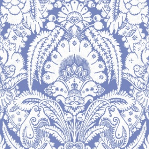
94-2012_q1

Albermarle

http://www.cole-and-son.com/en/collection-albemarle/wallpaper-94/2012/

Produced from an archive wallpaper sample the above image reflects the use of colour in historical wallpaper printing. A woodblock would be required to print each colour so papers would frequently have one printed colour only with the background paper serving as the second colour. More colours meant more blocks and consequently more expense. The richer the home, the more colours on their wallpaper.

cole-and-son-wallpaper-miami-105-4018-interior

Geometric II – Miami

http://www.cole-and-son.com/en/collection-geometric-ii/wallpaper-105/4018/

The above wallpaper contains many more colours that the original hand printed papers. Had this been block printed many blocks would have to have been cut, one for each colour, and aligned correctly. Advances in colour printing have allowed fabrics and materials with many colours to be printed quickly and easily however they have lost some of the ‘feel’ that comes with hand printed blocks, often looking a little flat when compared to their historical counterparts.


Norma Starszakowna

Scottish artist Starszakowana uses heat-reactive pigments, dyes, resin, metallics, digital, screen & relief print and hand-painting to create textile pieces for interior installations and fashion.

The colours used, to some extent, are not under the control of the artist as patination, heat reactivity and reaction of materials with each other are seen in this work, often leading to small random areas of colours resulting from chemical processes and reaction.
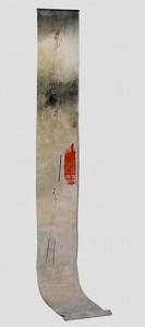
27114-large_custom_210x473_02630593

Dispora

http://www.vam.ac.uk/content/articles/d/diasporas-hanging-textiles/

Few colours can be seen from the photograph above but many tones and shades are visible from the heat reactive pigments and surface treatments when the original is viewed close up. This is an example of having some understanding of the materials used but still employing an element of serendipity as the exact outcome of the work might not be completely controllable.


Paul Smith

“You can find inspiration in everything and if you can’t look again.” So says the title of Paul Smiths recent book.

He is most well-known for his stripe design, the colours of which were taken from samples of traditional Guatemalan fabric. The stripes have been used on clothing, home accessories and even a car, via a partnership with Mini. This is a good example of colours being taken from a textile to form a colour palette for a new work.

senatus_cninuy

http://senatus.net/event/paul-smith-presents-multi-stripe-mini-exhibition-singapore/


Vlisco

The Vlisco group produces African printed fabric through a wax resist process, also known as ‘Wax Hollandais’ after the source of the original technique.

Each length of fabric undergoes 27 separate treatments over a two week period. A process that is still kept secret.

The colours used are mixed in house and are very vibrant. The fabrics are printed and dyed and the finished lengths are treated with an indigo dip and the final step in the dyeing process.

vl_fi_vl039250_r_00

https://www.vlisco.com/en/vlisco/types/wax-hollandais/vl039250.06/

The indigo dip brings all the colours together by giving them indigo as a common shade. This method is often seen in Indian textiles where sari fabric is recycled in to large throws for interior decor. The sari pieces may all be very different colours but by dying them in the indigo the origianl colours all become shades of the indigo.

6995web

Ptolemy Mann

neon check 40 x 50 pfm 22 adjusted 420

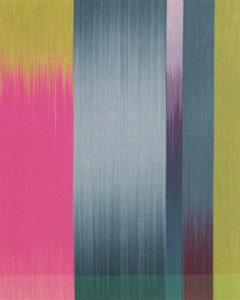
http://www.ptolemymann.com/rectalinear.html

The hand woven piece above is part of the rectalinear series. Mann hand dyes threads and when woven they result in this Ikat like pattern, where shades of one colour appear to melt in to another colour.

Much of this work has large, blocked areas of colour often using muted colours.

Mann also keeps a blog at https://significantcolour.wordpress.com/ this is mostly a marketing tool to showcase new work, exhibitions and commissions but there are occasional posts regarding inspirations and considerations about her own work such as https://significantcolour.wordpress.com/2015/05/19/this-creative-life/


Research Point Two – Digital Resources

A selection of links to online tools to create colour palettes were provided in the course materials. I have had a chance to use five of them and my results are posted below. Where a palette or colour scheme could be produced from a photograph I have used the same photo in each tool to give a comparison between each, posted below.
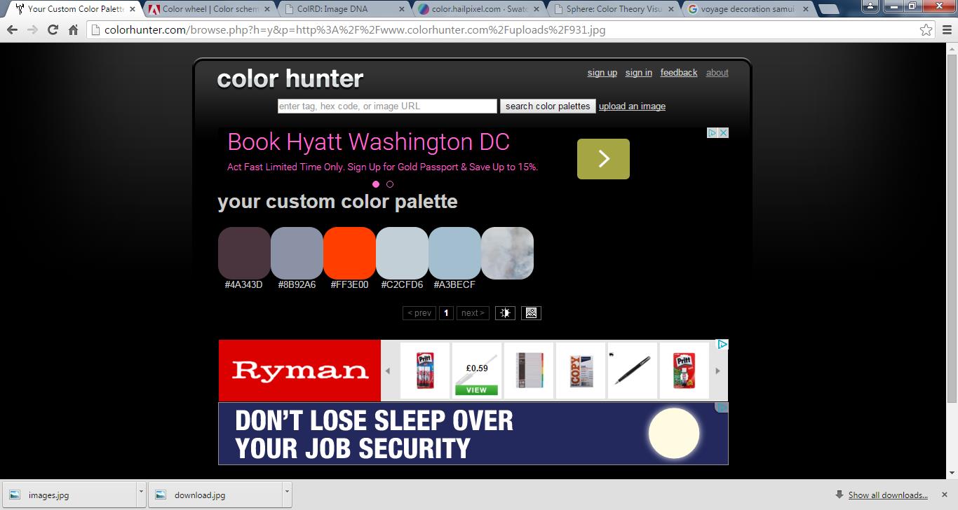
Lava


Colorhunter

http://colorhunter.com/

It is possible to upload photos to this site. I used some of my own photos and the site crashed each time. These files may have been too large but small images from the internet did work.

colorhunter

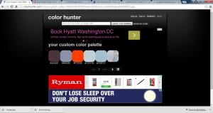
The palettes created from these images were five colours and seemed to be the five most prevalent colours in the image. This meant that any accent colours present in small amounts were not picked up in to the palette. This would be a good tool to use to determine the most dominant colours in an image.


Adobe

https://color.adobe.com/create/color-wheel/

This was an easy to use tool to create colour schemes conforming to colour theory. It was easy to choose the first colour and then select a rule that the colour scheme should meet such as analogous, complementary etc. Dark colours seemed difficult to select from the wheel but could be made using the sliders below the colour selections.

Each palette produced was five colours.

By clicking on the small camera icon on the right hand side of the screen photos could be uploaded to this site. A palette of colours was then selected from it. My own photos worked on this site so it would be my best option if I want to work from scans of my work or my own images. The colour schemes produced also pick up some of the accent colours in the image, this was missing from the Colorhunter site.

Adobe Bright Adobe colourful Adobe custom Adobe Dark Adobe Deep Adobe muted

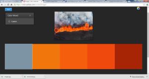
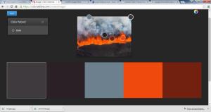
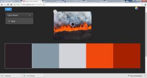
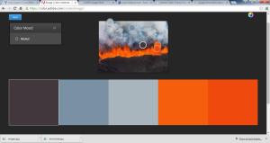
The custom colour schemes could also be manipulated from cool, bright, dark etc. It is also possible to sign in to the site to save any colour schemes produced.

ColRD

This site can be used to determine the hex value of a colour, useful for digital work if an exact reproduction of a single colour is required.

A colour gradient can be made to show shades from one colour to another.

Palettes of up to ten colours can be shown together on the screen. They are a bit fiddly to produce though as there are a selection of sliders on the screen that can be moved to change colour balance, saturation and hue. Hex values can also be entered directly. This was the largest palette size available on any of the sites I tried.

ColrD five ColrD seven colrD three

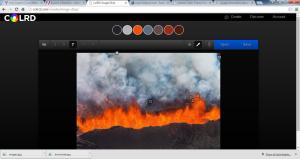
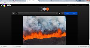
In ‘Image DNA’ photos can be used to generate palettes of three, five or seven colours. The trial palettes I created picked up a good selection of the visible colours.

Color

http://color.hailpixel.com/

This site works in a slightly different way to the others I tried. First the cursor is moved around the screen to select a starting colour. By clicking on the screen this colour is saved. Then a second colour can be selected and saved on the screen next to the first. Colours can continue to be selected and striped across the screen.

halipixel

The hex number is provided for each of the colours selected, these could then be used in other digital programs to replicate the colours selected.
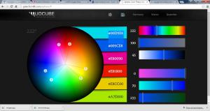
Mudcube

http://galacticmilk.com/sphere/

The link given in the course materials redirects to the website above.

This seems to be a more academic approach to creating colour schemes.

A colour is first clicked on the wheel and then a number of ‘arms’ show the position on the colour wheel of the other colours in the scheme selected.  The colour scheme can be changed through a series of drop down menu boxes, along with a number of vision selections such as decreasing single colour content. These options give some interesting colour schemes that wouldn’t be possible using only the standard colour scheme ‘rules’.

Mudcube.


These sites seemed to do the same things slightly differently.

I didn’t like the palettes the colorhunter site produced as it only picked up the first five colours in a piece and was lacking accent colours. Maybe this would be better if a small section of an image was uploaded to narrow down the area over which the site searched for colours.

I liked the Adobe site best for producing a colour scheme from my own photos. It was fast, easy to navigate and produced a palette with large enough colour blocks on my screen to let me appreciate the colours selected. Also the custom palette could be manipulated to be darker etc through an easy menu selection.

The Mudcube site gave some interesting colour schemes when using the vision options. It would be good to use this to provide some alternative colour scheme options.

The hailpixel site seems to be more suited to digital design where knowing the exact hex number of a colour is required to reproduce it elsewhere. This may be useful in the future so is a good tool to know about.

ColRD would be useful to produce three and seven colour palettes from a digital photo. It does not seem to select the same colours as Adobe so may offer a good alternative palette selection.


From the samples I have produced in each tool it seems that these sites may be best used in tandem rather than independently. Single colours could be picked in hailpixel, transferred to Adobe and then alternative palettes produced in Mudcube.

Digital photos could be uploaded to Adobe or ColRD and the palettes compared. The more ideas the better as far as I am concerned.

One thing to remember is that each screen will show these colours differently so if using the palettes generated to match threads the same screen should be used each time.

Something else to add in to future assignments then.


Leave a comment

Assignment Three – Reflection


Written Reflection

I had not used gouache paint before and it took a while to get used to the sort of consistency required to get a rich, flat colour. Some of the colour chips I produced were the correct colour but either a little too thin and streaky or too thick and had brush marks in them. I eventually got a good idea of how to mix the colours with water to achieve a good consistency.

I usually use acrylic paints so I found the chalky finish a bit strange at first. They did give a good consistent colour though.

Yarn wrapping was not an idea I had come across before but was a good way of trying to match colours using thread. Often I have had to use thread which is near-enough in colour but not the exact colour match. This showed how using two threads together could be a good way of matching a colour utilising the optical mixing of colours when laid next to each other.

The watercolour studies were quite eye opening. I opted to use the same glass items for each of the still-life studies but varied the colours I was able to view by changing the way each still-life study was lit.

All the above exercises showed how important it was to work from the image available in front of me at the time of the exercise and not to work from any memory of an image.

I again found the collages difficult. I have a sort of block when collage is mentioned. I did not enjoy putting the first part of this work together. I have fulfilled the criteria set out in the course materials but I am not happy with the work I have produced. I don’t feel that he Unusual and Complex colour scheme pieces could be taken any further, even though they fit the brief for each part of the exercise.

I do like the simplified collage, especially the black and white study. I can see here how textured and patterned papers can change the appearance of a collage from flat colour to something more interesting. Maybe if I worked in fabric this would be easier for me to tackle, perhaps that is something to think about for future work.


Reflection

I think that I have chosen my work well for this assignment. I have tried to avoid duplication other than where it can show how the application of colour might change a composition, such as the collages I included from Exercise 3.4.

I have chosen a simple and effective way to display my work and by displaying it in the order in which it was produced I feel there is a progression from the appreciation of colour in the original fabric samples to the final multi-coloured collage.

On reviewing my work I can see that there are lots of pieces that contain lines and sharp angles. From my sketchbooks I can also see that squares and lines form a large part of that work. I am also drawn to the work of others that contains lines and linear forms. This could be the beginning of a personal style, it is certainly something to look out for in future work.


4 Comments

Assignment Three

Assignment Three

Selecting and evaluation of work was the major focus of part three.

I started by viewing all the work I had produced for this section together. This work was to be displayed in a handmade book so I felt it was best to see what work there was and what size it was to then decide on a suitable book size.

When looking at the work all together I noted that there were some sections where what I had produced seemed repetitive so it would not all need to be included.

Exercise 3.1, Gouache studies, part one. I spent quite some time on these trying to mix the right colours to match the fabric samples. As a result the three neutral samples have been included and two of the coloured fabric samples.

The three neutral samples demonstrate how they may look similar but are in fact made up of more colours than first thought when they are studied a little harder. Also the surface textures cast shadows on to areas of the sample, between woven threads, at the edges of raised shapes, that also add to the number of visible colours or shades.

Two of the coloured samples are included as these show a range of colours mixed directly from some basic primaries and white. I used the third fabric sample in part one and part two of this exercise, the extended sample, so I did not see the need to duplicate it in both of the sections it had been used.

Part three was the extended neutral sample. This was very light in colour and I struggled to mix more than the two colours I used. I found this sample most difficult to match the colours for. I also drew in some lines to carry on the surface pattern outside of the sample I had chosen but the thin gouache paint did not cover the pencil lines so it looks a little messy.

Exercise 3.2 – translation through yarn. This was an interesting way to approach extracting colour from a source picture. I produced three yarn wraps but found that they looked very similar. As a result I have included only one in my final book, the first wrap that showed all the colours in the picture I had chosen.

I also chose to include a reference of where the painting was sourced from. I felt this was necessary as the fabrics I chose I cannot attribute to a source but the painting is recognisable as another’s work so I felt that should be included in the book.

Exercise 3.3 – Watercolour studies. This was another exercise where the outcome was very similar for each piece produced. I tried to vary the colours I would see by varying the arrangement of glass items used and the lighting source.

I have included two pieces from this exercise, one lit by a daylight bulb and one by a conventional small lamp. This gave a contrast between the colours observed through the glass, one has blues and greys while the other has more green and orange tones. The other pieces give a mixture of these colours so I did not include those as I don’t think they add anything to the work already selected.

Exercise 3.4 – Collage Studies. Of the six collages produced in this exercise four of them were similar in their composition, varying only in their use of colour. As Colour Studies was the title of this section of the course I decided to include these four collages to show how different colour schemes can be used in the same composition.

I thought that the two collages I discarded did not fit in with the rest of this work. The stripy collage had too many colours in it and the blocky collage felt too sparse in it composition to sit well against my other work.

After selecting the work I had to decide on the size and style of book to display it in. The largest item was A4 in size so I felt the book had to be a little bigger than that to allow the larger pieces to be displayed on the page with a small border around them. Smaller items could be grouped together to fill the page.

I felt A3 was a little too large but I did have some watercolour paper that was 15 x 10.5 inches (39 x 27 cm). It is an odd paper size and doesn’t have an international designation such as an ‘A’ size but it fitted well for this project.

The pages were perforated so this allowed them to be removed from the wire binding easily. I also removed the hard back cover of the sketchbook to use as the rear cover of my hand made book.

I began by arranging my work on to each page, keeping items from each exercise together. I left a margin at the left hand side of each page as I had chosen to use a stab binding to attach all the pages together. This binding can be hard to lay flat so I chose to put work only on the right hand side of each page as it would be difficult to see the entire left hand page when the book was opened.

I stuck the work on to each page and arranged it in the order it had been produced. This showed a good progression from mixing of colours in the gouache studies through to the collages produced in the last exercise.

I then printed out a word document containing the text I would need to label each sheet. This was then cut in to the appropriate size labels and added to each sheet. I tried to keep the labels in the same place on each page.

The back cover is a hard sheet of card from the sketchbook used above, this will also be useful as it will keep the book flat and support the work.

The front cover is a sheet of watercolour paper, covered with rice paper and dilute PVA glue. This gives a textured front cover with the strip of cartridge paper as a contrast.


I am pleased with the work I have selected and the layout of the book. It is a simple binding and the layout of the work allows the colours to be viewed against a light background.

The course materials suggest that this may need to be added to at a later date. With the binding I have chosen it would just need to be unthreaded, extra pages added and the binding be re-sewn.


2 Comments

Part Three – Project Two

Part Three – Project Two

Exercise 3.3

Watercolour studies

I selected three glasses, a jar, one bottle and a small heat-resistant dish to make up my still-life for this exercise. I set these on a white table with a white paper background. A window was behind the still life to cast daylight on to the sample but it was a little overcast on the day I worked on these.

I first chose to take photos of the still-life arrangement with different light sources to illuminate it.

Below are the photos I took and the light conditions for each.

DSC07489 DSC07490

L- Daylight without flash, R-Daylight with flash

DSC07491 DSC07492

L- Daylight and standard ceiling light, R- Daylight and small lamp

DSC07493 DSC07494

L-Daylight and daylight lamp, R- Curtains closed, ceiling light

DSC07495 DSC07496

L- Curtains closed, small lamp, R- Curtains closed, daylight lamp

DSC07497

For the final photo above I used as many light sources as possible – daylight, small lamp, daylight lamp and ceiling light.

As I thought the standard ceiling bulb gave a cream/yellow reflection on the items and the daylight lamp was more blue. My small table lamp gave the most yellow reflections as the bulb sits in a cream fitting that might have been reflecting on to the items.


I then set up five still-life studies and illuminated them differently. I reproduced the colours I saw in the items as stripes on strips of heavy cartridge paper with watercolour paint. I had to concentrate to remember where on my paper the lines should be placed in relation to each object.

Below is each still-life, details of the lighting and my watercolour samples.


Daylight only

DSC07489

1


Daylight lamp and small lamp

DSC07498

2


Small lamp

DSC07499

3


Ceiling light

DSC07500

4


Daylight lamp and ceiling bulb

DSC07501

5


I was hoping to get a dark red or bright purple amongst the colours visible in the glass reflections but as I had set them up on and against a white surface I only picked up the green or blue of the glass and some shadows and reflections of the lighting used. If there had been some other items in the area that could have reflected on to the glass that might have given some more interesting colours on my striped samples.

I was surprised how orange some of the reflected light from the light bulbs used was, but this added some variety to the colours of stripes I painted.


Exercise 3.4

Collage Studies

Clutter is not hard to come by here. So when the course materials said ‘take a photograph of a messy corner of a room or cupboard’ it was hard to know where to start. To limit my choices I chose to take a picture of the box room. I set the camera to automatically flash, pointed around the door and took one photograph.  The photo I took has a range of tones but not a huge range of colours. This is something that might be explored during this exercise.

DSC07517

I took the photo of the messy room in portrait but I think that the composition is better landscape. The paper bag covers a large area at the bottom of the photo when portrait but does not seem so dominant when landscape.

DSC07517 L

For all the papers I have I don’t have many coloured ones, I think that I have used what I have to good effect here.


Part One

Simple colour combination

For the simple colour combination I chose to simplify the shapes in the photograph. I focused on the brown areas and a contrast with the turquoise and white shapes. Blue and orange are complementary on the colour wheel so this combination of orange-brown and turquoise-blue should work.

I used turquoise paper, white card, grease-proof paper, wrapping paper, paper bag, card and bronze paper from some junk mail.

1


I like this simplified composition. The eye is drawn into the centre of the collage by the two bronze shapes. The turquoise paper is probably a little too light when compared to the original photograph but works well in this colour combination.

Unusual colour combination

First I looked at the colours in the original photograph that I rarely use, purple and orange stuck out immediately. I also saw some dark green at the bottom right corner in the biscuit tin lid and added this along with grey and the light brown background.

2

I simplified the shapes in the photo and extended the green and purple out to give larger blocks of colour. I used the light brown paper as the background to represent the plastered walls in the original photo. I felt the purple, grey, green and brown papers used had slightly muted colours and chose to use a very bright orange against these.

Purple, orange and green are a split-complementary colour scheme when looking at the colour wheel so there is some level of harmony between these colours. I find the orange colour I’ve used very warm against the cooler coloured papers.

I used this website to find relationships between the colours in my photo.

http://www.sessions.edu/color-calculator

I like this composition as it is not a direct representation of the original photo. I have been able to extend out some of the areas of colour to form another composition based on the original. I think that this is important as it shows how one photograph can be used to inform another piece of work, related but not identical.


Complex colour scheme

For this piece I considered the standard colour schemes, complementary and analogous didn’t seem complex enough . Triadic and tetradic colour schemes are possible but involve colours that are a fixed distance away from each other on the colour wheel so still have some order to them. I felt that a complex colour scheme should have more disorder to it.

I then looked at the photo I had originally taken and decided to stick a stripe of paper, 1cm wide, of each colour I could see in the photo, working from the left to the right, as far as possible.

3

I think that the piece I have produce details the colours used in the photograph but might have too many colours to be considered a colour scheme.


I have produced three collages for this part of the exercise that are varied in their composition and colour schemes. I tried not to reproduce the original photo in its entirety and focus on the colours and shapes in the photo, I think I have achieved this.


Part Two

I chose to use the collage from the simplified colour scheme above for the second part of this exercise. I liked the composition of this piece and the blocky shapes it contained.

Monochromatic Study – black and white

I first scanned the simplified colour scheme collage in to the computer and printed it our again in grayscale. This allowed me to gauge the tones in the piece to try and fit the papers I had available to the light and dark areas.

1 bw

I used white photocopy paper for the lightest area and black card for the darkest. This allowed me a huge range when picking the papers needed to depict the areas between these.

Pt 2 1 BW

Newsprint, a French novel page, lining paper with charcoal marks, a newspaper article and a black and white photo from an old book were used for the remaining shapes.

The density of printing on the novel page and newspaper article mean one appears lighter than the other. The novel page is lighter than the article. There is more space between the letters on the novel page making it appear lighter as more of the background paper is visible. Also the newspaper print on the reverse of the paper is visible making that paper appear darker.

The lining paper with charcoal marks is from the OCA study day I attended in October. I cut a piece of it out for my sketchbook and this was a ‘less interesting’ piece I did not use. There wasn’t enough to stick it on the collage in one piece so I cut it in to strips to cover the area required. Breaking up the lines like this had added some more texture to this area.


Single colour study

I have tried not to use blue much in this course as I am aware that much of my work before OCA was predominantly blue so I am trying to stretch myself. However, for this collage I chose to use the blue in the centre of the original photo to produce the colours range of colours I would need.

I used a cerulean blue acrylic paint as the mid-point for the colours used in this piece and began by painting this directly on to an A5 sheet of paper. I then mixed this blue with varying amounts of Payne’s grey, powder blue, phthalo blue, Prussian blue hue, ultramarine, white and metallic blue to produce the tones required and painted them on the further sheets of paper.

I used the grayscale printout from the first collage to inform tones of each section and choose the correct blue colour from the painted papers I had produced.

Pt 2 2 single colour

I mixed the colours directly on the paper so there are areas that have layers of thick paint. There are also brush marks in the surface of the paint. I think that this helps as by painting papers I could have had a very uniform, flat look to them, these marks and raised areas add texture to this piece.

I think that I have mixed a good range of colours and applied them in the correct areas. The metallic blue paint got a bit lost in the cerulean blue when they were mixed. The shiny pigment was obscured by the extra acrylic so there is no obviously metallic area on the final piece.


Multi-coloured

For the final piece in this exercise I chose to use torn papers from a magazine. I was aware that I had used single blocks of paper for each shape in the previous collages and wanted to use something different for this piece.

I sectioned off the background paper into the different shapes I wanted to represent so that I could stick the papers directly to the background as a support.

I used a single copy of the weekend magazine from the Times Saturday newspaper to provide all the coloured papers I would require. I chose to stick to just one magazine as it meant I had to look a little more closely at each page to pick out the colours I required.

I used the same outline as the previous collages produced in part two but did refer back to the original photo for an idea of colours.

Pt 2 3 multi colour

I enjoyed putting this together. I chose to tear the papers rather than cutting them as there are plenty of straight lines in my other collages. This approach also allows me to use many different colour papers and produce areas of colour that aren’t as flat as some of the other pieces I’ve produced.

Of the three collages produced in part two I like the black and white study most. The combination of papers used and their different surface patterns add more interest to this piece than flat, single coloured shapes alone.


Leave a comment

Part Three – Project One

Part Three – Project One

Exercise 3.1

Gouache studies

Finding samples for this exercise was difficult from the fabrics I had to hand. I have lots of blue fabric and lots of plain fabric but not so much that fit the criteria required for this exercise. I needed samples of three printed fabrics, where the design contained four to six colours, and three neutral fabrics that had an interesting construction or surface.

I started with the patterned fabrics, many of them had too many colours or not enough. I have lots of blue fabric but have used these in many projects in the past. As a result I have mixed many blue colours for artwork, mostly in acrylic, so felt I would make this exercise a little more difficult for me by trying to source patterned fabric in other colours. I eventually found a leaf print on a red background, a floral print on a cream background and a woven striped fabric. There was a little blue in one of the samples but it was not the dominant colour in the sample.

DSC07524 DSC07526 DSC07527

Part One

First, I looked at each printed sample individually and tried to count the number of colours in each sample. I found it helped to use a small viewfinder to mask off sections of each sample to view colours in isolation. In all the samples there was some degree of optical mixing, where two colours placed next to each other appear to be another colour. This approach also showed that several of the colours in each sample were shades of one another. This would be useful in mixing them to form the colour chips.

For the colour chips I first sectioned a sheet of paper in to 4×4 cm squares. I then returned to the first printed sample and reviewed each colour, I then picked one and considered some questions about it to decided what colour to start with to mix it. Was the colour warm or cold, was there a dominant colour that would help to mix it e.g. a yellow-orange. I then chose a starting colour from a selection of basics and began mixing.

Once I’d started a reconsidered the colour mixed. Was it correct? If not what was wrong? Was is too light, not enough or too much of one colour. How could I move the colour closer to the hue I was trying to mix?

I had a selection of pre-mixed colours but I did try to mix all the colours I needed rather than use colours straight out of the tubes. It is unlikely that they would have been correct straight out of the tubes anyway but I felt there would be more value from mixing the colours myself.

DSC07531

I use mostly acrylics so the texture and consistency of gouache was a little difficult to get used to. I was unsure of the viscosity of paint I would need to use. After a little trial and error it seemed that if the brush left marks in the paint once put on the paper, that was too thick. I therefore needed more water than I had thought, approximately 1/3 the volume of paint in the palette well. It was also important to ensure that the water was well mixed in to the gouache paint, otherwise the colour chip appeared ‘streaky’.

I had even less neutral, textured, fabric so acquired some samples from the Home Department at Marks and Spencer. These were, to the casual observer, all cream. This exercise showed that they were not all the same.

I used the same method as above, inspecting each sample, choosing a starting point to mix the colour then a little bit of trial and error. I found that using a small amount of an earthy colour and white gave a good selection of ‘cream’ colours for this exercise.

DSC07530

I found the gouache paint hard to get to the right consistency at first and probably have some colour chips that are a little too thick. Also the colour chips lightened when dried so I tried to mix a slightly darker colour than that required before painting the chips.

I am pleased with the samples I have produced and feel that I have a good start on using gouache paint.

Part Two

Extending out coloured sample

I chose to extend out the striped sample. I understand that this is a woven sample and not a printed one but I think this sample is a good example of how two different threads can combine via optical mixing to give a third colour. In this case a dark pink and a dark yellow. Loose threads at each cut edge also give a good indication of paint colours that might be used to mix the colours in this sample.

DSC07528

I sketched in the lines radiating out from the original sample and began filling these in with colour. I thought my hand was steadier but the lines I have painted are a little bit wobbly. If straight lines are required in future it might be worth masking off sections with tape to ensure a straight line is achieved.

I think that I have matched the colours fairly well. With more practice and a better understanding of the strength of each gouache colour it might be easier to get a closer match to the colours in the fabric samples.

Part Three

Extending out neutral sample

I used a different neutral sample for this piece, from a fabric pattern book. It is very light in colour but has some large raised squares as part of the design. These squares cast some shadows on to the flat sections of fabric. I did not include these in the painted piece as they are dependent on the direction of light falling on the fabric so would not always be in the correct place when viewed by someone else.

DSC07529

I could only pick out two definite colours from this piece. This may have been because the colours used were very light or might have been from working under the cream-light of an energy-efficient bulb. I still tried to match the colours as best I could even though I couldn’t pick out very many in this case.


These exercises have given me a good chance to get used to using gouache paints. I had a couple of different brands of paint and found that in this case you really do get what you pay for. The more expensive paints were thicker, had denser pigment concentration and were smoother when mixed with water. Some of the cheaper paints were almost ready to use out of the tube.

I enjoyed the challenge of mixing paints to match the colours in each fabric sample. It was also interesting to see how little of a second colour is needed to change the original when mixed. A dab on the end of a tiny brush can shift a colour with marked results. This was also an opportunity to use some of the ideas I had trialled from the Colour textbook (Hornung, D. (2012) Colour: A Workshop for Artists and Designers, (2nd Edition), London, Laurence King) regarding warm and cool colours and mixing complementary colours together. These exercises have changed how I view colours in textile work, breaking them down to their possible constituents.

Exercise 3.2

Translation through yarn

This exercise required a postcard or picture of an ‘Old Master’ painting. This term covers a wide variety of artists and long timeframe, from c1300 to 1830. I looked at the work of Jan Van Eyck, Vermeer and Goya and tried to pick a piece with an area of bright colour. I found many of the works had very dark colours set against a small, light area of cream or white.

I eventually settled on a piece painted by Goya. The Duke of Wellington, painted 1812-14

http://www.nationalgallery.org.uk/paintings/francisco-de-goya-the-duke-of-wellington

This painting is currently on display at the National Gallery, London, Inventory Number NG6322. It was first completed in 1812 but as the Duke gained more honours after his success in battle the painting was amended to include these new medals.

I downloaded the image of the painting from the website and printed it out but felt that the colours were too dark. I then put the image through Photoshop Elements and used the lighten functions to sharpen the colours. I printed this out again and was much happier with the new image.

I started by preparing some pieces of mount board to wrap the yarns around. I cut strips of 5cm by 25cm. These would probably be too long but I thought that it was best they were too big and that they could be trimmed later if necessary. I also stuck a strip of double-sided tape on the reverse of each strip to stick the ends of the thread to. This would help to keep the wrapped threads in place and prevent them unwinding from the mount board.

I then considered the colours in the image I had printed out and gathered threads, yarn and ribbon that might match those colours. I thought I had a large collection of this sort of material but it seems you can never have too many as I didn’t have exact or very close matches for many of the colours I would need.

The threads, yarns and ribbon I selected are below.

DSC07506

There is an example of each on this card, detailed below this photo is the materials type and its source.

DSC07523

Left

Red organza ribbon – Three Kings Ribbon, Country Baskets

Cream Perle 12 – Anchor

Beige crochet cotton – Unknown

Dark yellow cotton – Unravelled curtain tie-back

Yellow tussah silk – Texere

Gold elastic cord – Hobbycraft

Blue-black chenille wool – Unknown

Thick blue-green viscose ribbon – Texere


Right

Thick Red Ribbon – Saved from Chocolate box wrapping

Light pink wool – Unknown

White craft cotton – Unknown

Thick orange-red wool – Unknown

Grey-black alpaca wool – Sol Alpaca

Dark brown cotton gimp – Unknown

Stranded cotton – Anchor, number unknown

Light brown sewing cotton – Unknown


From the image I created three yarn wraps.

DSC07510

The first shows all of the threads I chose above. I thought that the first wrap should show all of the colours together. I tried to wrap them in the proportions they appeared in the image but I may have focused a little too much on the red and yellow and not enough on the dark expanse of background.

I then chose to mask off a section of the image and use the colours revealed in that aperture for the next wrap. I used the threads I had chosen in wraps of their individual colours except for the yellow thread which I laid in pairs. One light and one dark thread were wrapped next to each other alternately to give a darker yellow when viewed from further away. This was the only colour I did this for but I feel that this optical mixing of the light and dark yellows have given a richer colour.

DSC07511

I repeated masking off a section of the image for the third wrap.

DSC07512

This was an interesting way of looking at the colours used to make up an image, however the photographs of the yarn wraps don’t really reproduce the image I was working from or the colour of the threads used very well.

From finding the image on the National Gallery website, the colours on the screen, the dark first image I printed, the final lightened image and then the photographs of the wraps I’d made were all different. This highlighted that transferring images from real life to digital media may not convert the colours exactly and vice-versa when printing from a computer image. Colour settings on the camera, then the computer screen and finally the printer will all add to visible changes in colour. When translating printed colour to physical colour I found it important to work only from the printed image I had in front of me and not try to work from the memory of the image I might have.